Website Builder Templates (Kits) Library

UX DESIGN for Growth & Conversion

WHEN
2022
ROLE
Senior UX Designer
WHERE
Elementor

Website Builder Templates (Kits) Library

UX DESIGN for Growth & Conversion

Info

About

Elementor is a leading WordPress website builder platform, enabling web creators to build and design professional websites with ease. Elementor serves a wide range of users, from professional designers to small business owners.

What

The Template (kits) Library project aimed to improve the exploration of templates within the library. The goal was to make it easier for users to find relevant templates and improve overall engagement with the library, enhancing the user experience and making the library more effective as a strategic resource.

Why

The project was initiated to address several critical challenges that arose from the shortcomings of the previous library version:

  1. Low Conversion Rates with High Growth Potential: The previous version of the template library failed to provide a smooth exploration experience, resulting in low conversion rates despite high traffic. Users found it difficult to find relevant templates due to the lack of filtering and search functionalities. The template library represents a significant growth opportunity, as improving usability could convert traffic into paying users.
  2. SEO Limitations: The older library version lacked dedicated category and individual template pages, which hampered its ability to rank for non-branded keywords. As a result, the library’s reach to new users through organic traffic was limited. Addressing these SEO issues was essential for driving growth.

Team – UX Lead and UX Research – Aviya, UI – Yanki, Design Team Mangers – Erez, Ronit

Before

Original template library before redesign
Main challenge

Turning the Template Library into a Strategic Growth Driver

Improving template exploration to turn traffic into higher conversions

Research

Research process and methods

A comprehensive research process was conducted to identify the specific pain points and challenges users faced when interacting with the template library.

This involved gathering insights from various stakeholders and users, utilizing behavior tracking, and analyzing competitor practices.

Stakeholders Interviews

The template library webpage had undergone several changes in ownership over time, transitioning between different departments and stakeholders. Although multiple teams felt a degree of responsibility for the page, there was no clear, consistent ownership to ensure its ongoing maintenance and improvement.
This resulted in fragmented accountability and a lack of coherent strategy for optimizing the user experience.

Through interviews with 12 key stakeholders, the project team gathered valuable insights into how the template library was perceived, its current limitations, and the company’s vision for future development. These interviews helped align the project with Elementor’s broader strategic goals and set clear priorities for enhancing the library.

Behavior Tracking, SEO Insights, and Data Analysis

Using tools like Hotjar, we tracked user behavior and interactions within the template library to understand how users navigated the platform, where they encountered difficulties, and when they dropped off.

This data revealed patterns, such as users getting stuck on template pages and cycling between different options without finding a clear path to conversion.

Additionally, we analyzed internal data to identify how templates were being used and explored general patterns in template interactions.

For missing data on filters and searches, we relied on SEO insights to uncover which searches were popular and what categories users explored. Together, these insights gave us a clearer picture of how different user groups interacted with the library and what their specific needs were.

User Interviews

Who We Interviewed and Why

We conducted online interviews with a variety of 10 users worldwide to gather a wide range of perspectives.
This included both experienced users who were familiar with the template library and new users with fresh memories of their first exploration of the library.

One of the key challenges we faced was accessing non-Elementor users, who were part of the original target audience for the template library.
Understanding why these users were not engaging with Elementor’s templates was crucial.
To address this, we employed a guerrilla-style approach, conducting informal interviews with non-Elementor website creators.
These interviews helped uncover why they preferred alternatives or avoided using pre-built templates entirely.

With limited time, For Non-Elementor users, we used guerrilla-style interviews to learn why they weren’t choosing our platform and what drove them to prefer alternatives.
What We Wanted to Understand

Our objective was to gain a deeper understanding of why users were not fully engaging with the template library and templates, and what improvements could enhance their experience. We aimed to gather insights into the following areas:

  • Missing Data Points: We wanted to find out what information we weren’t yet tracking that could help us. This included things like which free templates users searched for, how they explored the templates (e.g., previewing or scrolling), which categories or filters were most popular, and how they made decisions when choosing one template over another. Understanding these behaviors would help us improve search and filtering options and better align the library with user needs, making the selection process easier and more efficient.
  • Understanding User Pains: We aimed to identify the difficulties users faced while navigating the library. Did they abandon their searches? How many templates did they explore before making a decision? These insights would help us improve the user flow, making the template exploration process smoother and more intuitive, guiding users from discovery to action.
  • Identifying Barriers to Template Usage: We wanted to understand why some users were hesitant to use templates. Common concerns included limitations in customization, lack of uniqueness, and issues with optimization. By learning about these concerns, we could focus on addressing them when designing the new library. Knowing what users were worried about helped us highlight these areas and give users more confidence in using templates.
Limited adoption within our users drove us to explore the 'why not', a strategy I initiated through qualitative research to uncover barriers and unmet needs. This later shaped the library into a tool users could confidently engage with.
  • Exploring Template Decisions on Other Platforms: We also explored how users searched for and selected templates on other template libraries and platforms they used. This allowed us to gather insights on what worked well on those platforms and what didn’t, helping us design features that would align with user expectations and behavior, even outside of Elementor.
  • Gaining Insight into Non-Users: For non-users, especially those unfamiliar with Elementor, we wanted to uncover what would make them consider using Elementor’s templates over other options in the market. We aimed to learn what would make non-users consider using Elementor’s templates over other options in the market. Were they aware of the value the library offered? Were there specific features or improvements that could make it more appealing? These insights would help us refine the library’s offering and make it more attractive to a wider audience.
Observing how users navigated other template libraries gave us unique insights into their decision-making process and the features guiding their choices.

Competitive Analysis

In addition to the regular analysis of direct competitors and related platforms with similar features and filtering systems, and as mentioned above, we took a unique approach during user interviews by having users—both Elementor and non-Elementor—show us how they engaged with other template libraries. This hands-on exploration gave us deeper insights into their behaviors and decision-making processes, helping us identify best practices and opportunities to improve Elementor’s Template Library.

Key Findings from the Current System

01

Exploration Difficulties and Lack of Search and Filtering Tools

Users found it difficult to navigate the template library due to the absence of search and filtering tools. This lack of functionality led to frustration and abandonment of the template exploration process, particularly for new users who struggled to find templates efficiently.

02

Customization and Uniqueness Concerns from User Interviews

Users expressed concern that pre-designed kits would limit their ability to create unique designs for clients. This was surprising, given that those users are web creators who can modify templates extensively to create distinct designs. Despite this, many felt templates might compromise the custom solutions they promised to clients, leading them to avoid templates altogether.

03

How Users Choose a Template

We studied how users pick templates, finding two key drivers through interviews and observations:

  1. Visual Appeal: Users often based decisions on design aesthetics, even when aware that colors and elements could be customized.
  2. Required Features: Templates offering specific functionalities relevant to their needs played a crucial role in decision-making.
“By the time I look for the right template, I could have finished building it myself”
white skip icon 1
Skip Section

Main Insights

01

Addressing User Barriers to Boost Template Adoption

To increase template adoption, we must address key user concerns around performance, customization, and uniqueness. Users need reassurance that templates can be customized without compromising their creative vision and optimized to maintain site performance. Clear messaging about the flexibility and optimization of templates will help overcome these barriers and drive engagement.

Why it’s important

By directly addressing concerns about performance and creative limitations, users will feel more confident adopting templates. Clear communication about template capabilities, particularly around customization and optimization, is essential to reducing hesitation and increasing overall engagement with the library.
02

Templates as an Inspiration and Learning Tool

User interviews revealed that professional web creators, whether they are new or mature users, explored templates not only for creative design inspiration but also to understand how features and functionalities were built. They often looked for specific features, exploring how things were structured and implemented to find inspiration for their own designs.

Why it’s important

This insight highlights the dual role of templates as both creative and technical learning tools. By recognizing this, the template library can cater to a broader audience, appealing to web creators seeking to enhance their design and development skills. Positioning the library as a resource for learning and inspiration, with a focus on specific features and functionality, can significantly boost engagement from both new and experienced users.
03

Guiding Users with a Clear Exploration Flow for Growth

The original template library lacked a structured exploration flow, leading users to abandon their searches or get lost in the process. Redesigning the flow with clear guidance and calls to action is essential for ensuring a smooth journey from browsing to selecting templates. This will keep users engaged and help drive conversions.

Why it’s important

Without a well-structured path, users in the old version struggled to complete their actions, which hurt engagement and conversion rates. A redesigned flow will not only improve the user experience but also significantly contribute to growth by ensuring users reach key decision points efficiently.

04

Boosting Growth Through Improved Template Discovery

Effective search and filtering tools are critical not only for enhancing user experience but also for driving SEO and growth.

Why it’s important

The lack of search and filtering tools limited the template library’s visibility and discoverability, impacting both user engagement and organic traffic. From an SEO perspective, implementing these features would significantly improve the library’s ranking in search engines, leading to increased traffic and higher conversions. This insight highlights the dual role of search and filtering tools in improving both usability and growth potential.

powder color skip icon 1
Skip Section
white skip icon 1
Skip Section

Suggested Solutions

Main Design Chllenge - NR.1

Laying the Foundation:
MVP Focused on User Engagement and Conversion

The mission was to improve the discoverability and usability of the Template Library to boost conversions and provide users with a more intuitive experience.

The MVP was designed to tackle immediate user frustrations while building a foundation for future enhancements. Each design decision was carefully crafted to improve user engagement, address concerns about template usage, and guide users more effectively toward conversion.

Note: Due to time constraints, we adopted a flexible approach, working in parallel and collaboratively. Some UX changes were implemented directly during the UI process to maintain efficiency. Therefore, in this case, I will focus on presenting the UI to showcase the integrated solutions.

Engaging Exploration Flow:
Turning Discovery into Conversions

The previous version lacked a clear flow, leaving users frustrated and causing them to abandon their searches.

"We designed the exploration flow to be seamless, guiding users from discovery to action
Design challenge nr.2

Improving Template Exploration and Driving Organic Discovery

User research revealed significant barriers in the discovery process, with users struggling to find templates efficiently. To address this, we focused on creating an intuitive search and exploration experience that aligned with user expectations while ensuring discoverability aligned with business goals.

A close collaboration with SEO specialists was integral to shaping the filtering system, content structure, and navigation, making the discovery process both seamless for users and optimized for organic traffic growth.

CTAs in Template Exploration

We redesigned the flow to strategically place CTAs, guiding users from browsing to selection and into the editor—based on user behavior insights.
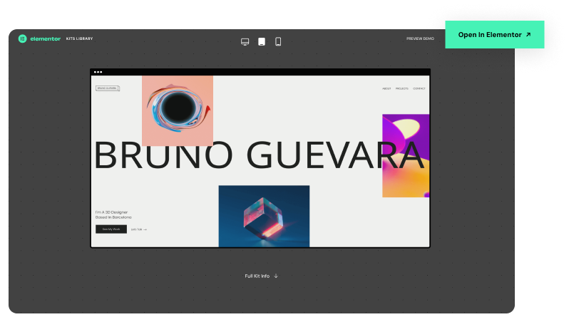
Template Info Page:
 An “Open in Elementor” CTA led directly to the template in the editor, increasing signups and purchases.
Full View – New Tab:
 “View Template” opened in a new tab, supporting comparison habits. Tabs included branded headers with CTAs to convert or return, sustaining engagement even after users left the library.

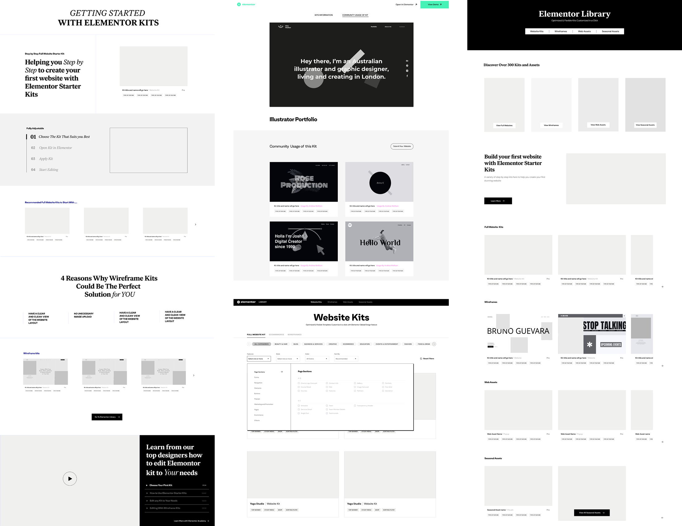
Category-Based Filtering

The MVP introduced a category-based filtering system prioritized to meet SEO requirements – Exposing categories on the page was critical for optimizing indexing and driving organic traffic.
The filtering dynamically “shrinks” on scroll, ensuring continuous visibility and smooth navigation.
On mobile – categories are presented in a shrunk format and can be expanded via a dropdown, opening a popup. SEO also drove the implementation of a dedicated category page and pagination, aligning design and content strategies with key business objectives.

Templates Feed – Supporting Decision-Making

Focused Browsing Experience – Reducing Cognitive Load

User research revealed that users rely heavily on visual cues when evaluating templates, making clarity and focus essential. The MVP used a two-per-row layout to reduce cognitive load, improve browsing, and highlight design quality. While shaped by content and development constraints, this approach also laid the foundation for future features like video-on-hover and tag-based filtering.

Feature-Based Filtering Tags

Research showed that highlighting key functionalities could help users quickly identify templates aligned with their clients’ requirements—supporting more efficient decision-making.1

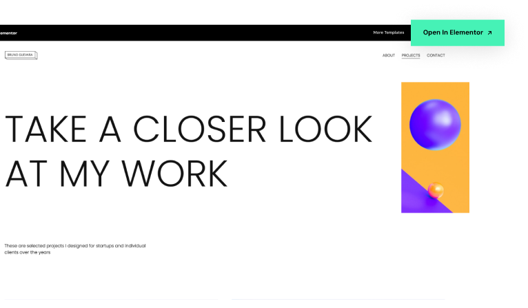
Template Detail Page

(Overview Exploration)

The detail page includes an iFrame to explore the full template on mobile, tablet, and desktop, plus a persistent option to open it in a new tab.

View-by-Page Exploration:
Research showed that WordPress users expect full-page browsing. An anchor menu enabled quick navigation between pages.

Addressing Concerns:
Interviews revealed concerns about performance, optimization, and customization. Clearer messaging helped build user trust.

Mobile Detail Page

Optimizing for Mobile Browsing

On mobile, the detail page was streamlined to showcase only the mobile version view, optimizing how the template is displayed within the format. Detailed pages were excluded to avoid endless scrolling and better adapt to mobile usability.

To maintain continuous engagement, two sticky buttons were placed at the bottom of the page, allowing users to preview the full version, which opens in the same tab and facilitates seamless progression toward subscription and purchase.

By addressing users' concerns, we ensured that the template library not only met their needs but also built trust and confidence in using it

Results

Main challenge
Initial Results and Key Success Factors

The initial results from the MVP showed clear improvement:

  • Improved Engagement: Users interacted more with the new filtering and search features, making it easier to find templates and reducing frustration.
  • SEO Growth: The new structure allowed the site to rank better for non-branded keywords, driving more organic traffic. The traffic grew significantly, with the template library becoming a key driver for overall site visits.
  • Conversion Increase: Early signs showed that conversion rates began to improve as users were able to find and use templates more efficiently. The updated flow not only improved conversion rates but also established the template library as a significant part of the sales funnel, directly contributing to subscriptions and becoming a key partner in promoting the hosting product. It transformed the template library from a static resource into an active sales tool.
This future-ready system not only meets current demands but is built to handle the challenges of tomorrow.
next steps

Future Development (Advanced Kits)

Following the success of the MVP, the team began working on a more advanced iteration of the template library.

This phase aimed to introduce additional templates, enhanced filtering options, and instructional content to guide users through the kits.

However, although this work was already in development stage, the project was not fully carried through due to a shift in priorities.

More screens from this project

Advanced Library Design Team:
UX lead – Aviya
UI – Yael
Design Managers: Erez, Ronit

01

B2C Customer Service APP

UX Design

WHEN
2019/2020
ROLE
Senior UX Product Designer
WHERE
Global leader in CS solusions

Info

About

The company focuses on providing customer service solutions for businesses (B2B). This project was developed within the company's innovation department.

What

The app is the company's first B2C product, designed to facilitate connection and act as a realtor between users and customer service providers.

Why

The app MVP goal is to overcome the “time-consuming” feeling users has expressed when calling a call center.

What else

Extra Challenge: Engaging a Team of Developers New to Collaboration with Designers.

Before

Before I joined the team, the team’s initial goal centered around creating a technical prototype to demonstrate feasibility, with an emphasis on showcasing technical capabilities.

Upon joining, my first task was to redesign the app to address key issues before a large Alpha testing phase.

This is what I inherited to begin with.

Original screens before redesign

Research

Sub-challenge

Bridging the Gap through Research

Empowering Team Engagement to Prioritize UX Issues
Research process and methods

As my main mission was to improve user experience and address important product issues before the Alpha phase, I recognized the challenges of prioritization within our product. Understanding that our team was new to working with a designer, especially in UX design, I saw the importance of involving them in this process.

My goal was to actively engage the team and deepen their understanding of the significance of necessary UX enhancements.

To accomplish this, supported by the product team, I pursued a multifaceted approach with a strong emphasis on the research phase to gain their full collaboration.

The secondary objective of this research session was to actively engage the team and deepen their understanding of the importance of required user experience improvements.

User Testing & Interviews

In addition to prior research that has been done, due to a prioritization challenges of key issues in the product, I initiated an extensive user testing session with 17 participants.

The goal of this expanded user testing was to enhance the team’s understanding of the importance of the required user experience improvements.

Seamless Live Streaming for Team Engagement

With user comfort in mind, we maintained a minimal presence in the interview room. Nonetheless, we encouraged team involvement by allowing them to participate via live stream – an unusual but valuable step.

LDJ Workshop

After completing the user testing and interviews, I led a one-hour “Lightning Decision Jam” with the team. This rapid session aimed to promptly address pressing issues identified during interviews and testing, even before a full analysis. The goal was to rapidly align on urgent UX issues while insights were still fresh.

Research Analysis & Classification

We had many interesting conclusions from the user testing and interviews.

I analyzed and classified the information we received in the interviews and questionnaires to examine trends and extracting unique and relevant information on special usage, thoughts or behaviors that we did not anticipate

USer testing example
Before user testing, data indicated that our initial test group of 10 users did not use the search field effectively.

Why it’s important

The app is designed to ensure a seamless user experience by promptly guiding users to the appropriate department for quick assistance. To optimize performance, users are encouraged to specify both the provider they wish to contact and the reason for their call. Failure to do so may prolong their process.

*Note – At at this stage, I was limited to work with the existing screens

Original Screens

Identified issue

I’ve noticed that the copy is not communicating this ideal way to search the system:
who + why (and not or)

in addition the “issue” scroll was very long making it difficult to find the required issue.

Repeating Problem

During the USER TESTING

We’ve tested a few different solutions based on the current screen to better understand the issue some were done spontaneously on the spot after the first day of testing, and some in advance.

*Note - At at this stage, I was limited to work with the existing screens.

Repeating Problem

During the USER TESTING

The animated test did work on getting the users’ attention and they even read it outloud, BUT the outcome was the same.

User Testing Key Findings

While privacy emerged as a primary concern, it’s crucial to note that “Recording and transcribing” calls was the most appealing feature among all users, even those with lower adoption rates.

01
90%

Rare natural detailed requests

Only 1/17 users used a full sentence (provider+issue) naturally BUT made a very long sentence.

02
90%

Knowing, Not Doing

Despite users reading the instructions within the app out loud and comprehending the need for a complete request, they instinctively asked only for the provider’s name.

03
90%

Guided Users: Complex Queries

Other users, that were specifically guided by us to compose a full issue + provider sentence, created excessively complex sentences.

Main Insights

01

Calling a Provider & Search Experience

User testing showed that users often produced sentences that were either incomplete or too complicated, which made it difficult for the app to call a provider and reach the appropriate department. In addition, the long “issue” scroll complicated finding the required issue.

Why it’s important

The app aims for a smooth user experience, quickly directing users to the right department for a prompt assistance.

This is crucial for two main reasons:

  • Product limitations and development requirements: Swiftly acquiring this information allows backend calling and navigation processes to begin, keeping users engaged with the app.
  • Streamlined Interactions: Pre-collecting this data can simplify user interactions, supporting the primary goal of a fast and effortless experience.
02

Call recording & Transcript

Users failed to notice the recording message. During user testing, users were tasked with locating their call history. It was only upon completing this mission, unaware of its existence, that they discovered the app had been recording their calls.

Why it’s important

While privacy emerged as a primary concern, it’s crucial to note that “Recording and transcribing” calls was the most appealing feature among all users, even those with lower adoption rates.

03

Repeating Calls

Through user interviews and questionnaires, it became evident that users frequently encounter recurring issues and frustration due to unresolved problems or disconnections, leading to multiple calls for the same issue.

Users also consistently contact the same providers and departments over time, regardless of previous issues.

Why it’s important

While this issue highlights larger concerns that require broader solutions, the MVP’s primary focus was on refining the calling experience, making this insight essential for resolution and improvement of this feature.

04

Call Timing Preferences

From both interviews and questionnaires, all working individuals with typical “9-5” schedules mentioned that they perform their tasks during the daytime while at work, with many specifying the lunch break as the most common time.

Why it’s important

The wait for a customer service provider usually involves a significant amount of time. Understanding that users are calling during working hours is essential because they might initiate the call when they are free, but the customer service may take time to answer, potentially leading to users being in a meeting or unavailable at work when the call is finally answered. This factor should be taken into consideration.

05

Trust Issues & Anxiety

Primary Discovery: During user testing, we observed that despite the presence of a progress bar displaying estimated call duration, users remained fixated on the screen, even when engaged in conversation. Upon inquiry, several concerns emerged:
  • Trust: Users expressed uncertainty about the app’s reliability in initiating the call.
  • Inadequate Communication: The progress bar lacked clarity, providing only basic steps without conveying sufficient information.
  • Anxiety and Curiosity: Users felt anxious or curious about monitoring the call progress.
  • Uncertainty About Wait Status: Users, accustomed to hearing music while waiting, were unsure if they were still on hold.

Why it’s important

The app aims to seamlessly connect users with call centers, serving as the intermediary. However, when users remain fixated on the screen, this objective is not fully achieved. Additionally, it’s crucial to build trust in the app for users to feel calm and reassured about their call’s progress.

Suggested Solutions

Design challenge nr.1

Enhancing Call and Search Experience

Reminder & Approach

User testing revealed the urgent need for an improved and swifter search experience.

Acknowledging that users may not always interact with the ‘CS assistant’ system as intended, my approach focused on effectively guiding them while offering essential assistance. Recognizing that In spontaneous interactions, users may not articulate themselves optimally, I aimed to enhance navigation by anticipating needs and streamlining processes.

*Note – Presented here are low-fidelity designs based on the wireframes, integrating one of the proposed branding concepts for testing purposes.

I addressed this challenge through several strategies:

Home Screen - Recent Calls / Your Providers

  • The search field is positioned at the center while ensuring compatibility with both voice and text inputs.
  • While first-time users are presented with preferred providers.
  • Returning users benefit from access to their recent calls,
  • Additionally, search results are tailored based on provider relevance.


*Note – Low-fidelity designs based on the wireframes, integrating one of the proposed branding concepts for testing purposes.

User profile & Add Providers

Users can set up and update their profiles at any time, allowing them to customize their list of preferred providers for a more personalized and seamless experience.

This also helps the system anticipate their requests more effectively.

Smart Autocomplete

We implemented a smart autocomplete system capable of adapting to different sentence structures.

This included:

  • Utilizing the navigation tree (IVR)
  • Integrating popular inquiries
  • Implementing a history-based approach.


As for the Alpha phase, our focus was on leveraging the existing navigation tree as the foundation of our efforts.

Design challenge nr.2

Emphasize Call Recording & Transcription

Reminder

In testing, users missed the recording message.

Privacy is a primary concern, yet “Recording and transcribing” calls was highly favored by all users, even those with lower adoption rates. I approached this issue both in the initial chat and the providers screens.

Call recording & transcript - Chat

This feature encompasses several aspects:

  • Introduction: Displaying it prominently within the chat.
  • Privacy: Highlighting crucial privacy and legal aspects using simple language.
  • Flexible Options: Providing multiple choices to enhance usability:
    • Record all calls
    • Record all calls from a specific “provider”
    • Record only the current call

Call recording & transcript - Settings

Additionally, users can define their preference in their profile at any time.

Design challenge nr.3

Call Now or Later

Reminder

We found that users often make calls during work breaks, where they may not be available when the call is answered. To address this, we aimed to provide users with a greater sense of control and flexibility over their calls.

Call timing

Once the system is predicting the call timing, we communicate it to the user.

In this same message, taking in consideration that the timing of the returned call might not be comfortable, we offer the user the possibility to “call later”, scheduling the call for a more convenient time.

Additionally, when a call arrives, users can decline and reschedule it for later, with an indication appearing on the home page.

Design challenge nr.4

Trust and Anxiety

Reminder

Following the user testing, my goal is to create a more engaging wait experience and build trust step by step.

I offered a few solutions:

Trust Issues & Anxiety

  • Keeping it “familiar”: Users can connect their personal Spotify for enhanced hold music, which stops when the call arrives.


  • Call progress is visually represented and changes with each step, providing entertaining content for screen-fixed users. GIFs were chosen for the MVP due to their ease of development.


  • Additionally, we explored advanced entertainment options, including partnerships and implementations.

Results

Sub-challenge
Enhancing Team Engagement Through Research

The team’s commitment to the research was remarkable. Even the off-site development team took the initiative to observe live user testing and recorded sessions.

This not only enhanced their comprehension of the significance of implementing UX changes but also generated enthusiasm within the team for the project.
Features implementation

Assessing Improved Capabilities

Alpha Test Results

The Alpha test was conducted gradually with 50 employees.

It involved evaluating the new search abilities, though with some limitations:

  • Autocomplete was based IVR (phone tree)
  • Autocomplete based on users’ history
  • Tags based on phone tree (IVR)
  • Partial autocomplete based on popular issues, without AI integration


Initial data indicated an immediate enhancement.
However, given that these were internal users, we cannot guarantee they solely utilized the app for its intended purpose, despite our guidance.

Results from Follow-Up User Testing (5 Users)

After the initial user testing and throughout the alpha phase, the additional features were evaluated and proven effective.