

Multi-Provider B2C Customer Service Helper
Driving Team Alignment Through UX Research
Info
About
The company focuses on providing customer service solutions for businesses (B2B). This project was developed within the company's innovation department.
What
The app is the company's first B2C product, designed to facilitate connection and act as a realtor between users and customer service providers.
Why
The app MVP goal is to overcome the “time-consuming” feeling users has expressed when calling a call center.
What else
Extra Challenge: Engaging a Team of Developers New to Collaboration with Designers.
Before
Before I joined the team, the team’s initial goal centered around creating a technical prototype to demonstrate feasibility, with an emphasis on showcasing technical capabilities.
Upon joining, my first task was to redesign the app to address key issues before a large Alpha testing phase.
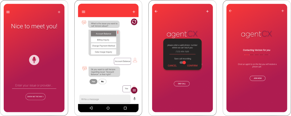
This is what I inherited to begin with.
Research
Bridging the Gap through Research
As my main mission was to improve user experience and address important product issues before the Alpha phase, I recognized the challenges of prioritization within our product. Understanding that our team was new to working with a designer, especially in UX design, I saw the importance of involving them in this process.
My goal was to actively engage the team and deepen their understanding of the significance of necessary UX enhancements.
To accomplish this, supported by the product team, I pursued a multifaceted approach with a strong emphasis on the research phase to gain their full collaboration.
User Testing & Interviews
In addition to prior research that has been done, due to a prioritization challenges of key issues in the product, I initiated an extensive user testing session with 17 participants.
The goal of this expanded user testing was to enhance the team’s understanding of the importance of the required user experience improvements.
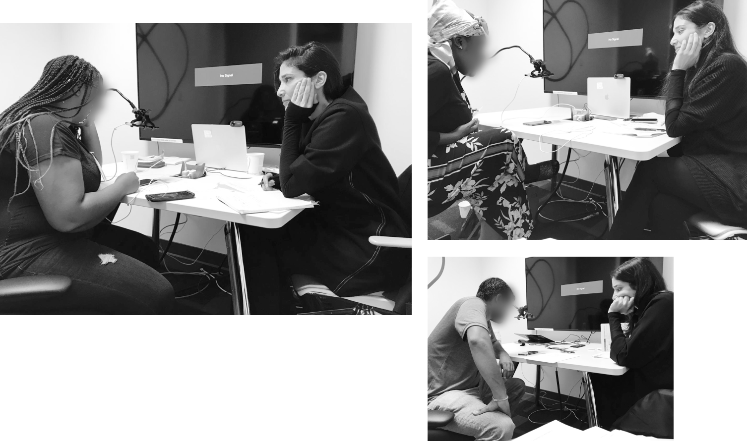
Seamless Live Streaming for Team Engagement
With user comfort in mind, we maintained a minimal presence in the interview room. Nonetheless, we encouraged team involvement by allowing them to participate via live stream – an unusual but valuable step.
LDJ Workshop
After completing the user testing and interviews, I led a one-hour “Lightning Decision Jam” with the team. This rapid session aimed to promptly address pressing issues identified during interviews and testing, even before a full analysis. The goal was to rapidly align on urgent UX issues while insights were still fresh.
Research Analysis & Classification
We had many interesting conclusions from the user testing and interviews.
I analyzed and classified the information we received in the interviews and questionnaires to examine trends and extracting unique and relevant information on special usage, thoughts or behaviors that we did not anticipate

Calling a Provider
Why it’s important
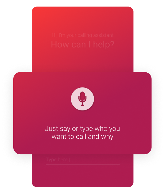
The app is designed to ensure a seamless user experience by promptly guiding users to the appropriate department for quick assistance. To optimize performance, users are encouraged to specify both the provider they wish to contact and the reason for their call. Failure to do so may prolong their process.
*Note: For this user testing, I was limited to the existing prototype. Only minor adjustments could be made at this stage, with the understanding that the final solution will incorporate a new design.
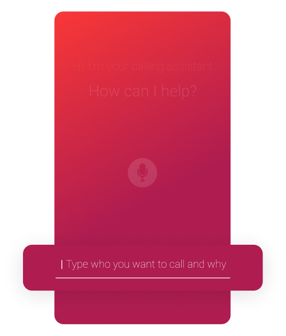
Original Screens
Identified issue
I've noticed that the copy does not effectively communicate the ideal way to search the system—who + why (not or)—which may be contributing to this issue.
Additionally, the scroll was too long, making it difficult for users to find the required issue within the app’s suggestions. This often led to misselection or reliance on the free-text input.
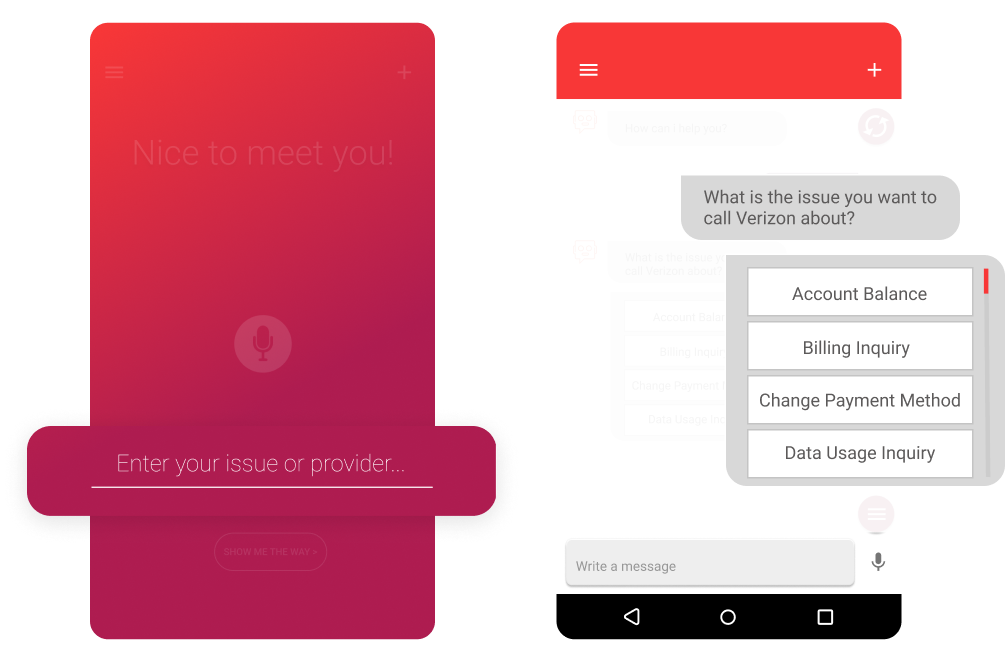

Issue NR.1
During the USER TESTING
We tested multiple solutions within the existing screen framework to better understand why users were were struggling to select the correct issue.
Some adjustments were made spontaneously after the first day of testing, while others were planned in advance.
The animated test successfully captured users' attention—they even read it out loud—but the behavioral outcome remained unchanged.
Note: At this stage, I was limited to working with the existing screens.

Issue NR.2
missing call recording
On the original screens, the chat displayed only the provider call request.
A pop-up then prompted users to update their phone number and initiate the call, with a call recording toggle set to "on" by default.
During user testing, when asked to find their recordings, users were surprised to discover their calls had been recorded, as they had never noticed the option despite seeing the screen multiple times.

User Testing Key Findings
While privacy emerged as a primary concern, it’s crucial to note that “Recording and transcribing” calls was the most appealing feature among all users, even those with lower adoption rates.
Rare natural detailed requests
Only 1/17 users used a full sentence (provider+issue) naturally BUT made a very long sentence.
Knowing, Not Doing
Despite users reading the instructions within the app out loud and comprehending the need for a complete request, they instinctively asked only for the provider’s name.
Guided Users: Complex Queries
Other users, that were specifically guided by us to compose a full issue + provider sentence, created excessively complex sentences.
Main Insights
Calling a Provider & Search Experience
User testing showed that users often produced sentences that were either incomplete or too complicated, which made it difficult for the app to call a provider and reach the appropriate department. In addition, the long “issue” scroll complicated finding the required issue.
Why it’s important
The app aims for a smooth user experience, quickly directing users to the right department for a prompt assistance.
This is crucial for two main reasons:
- Product limitations and development requirements: Swiftly acquiring this information allows backend calling and navigation processes to begin, keeping users engaged with the app.
- Streamlined Interactions: Pre-collecting this data can simplify user interactions, supporting the primary goal of a fast and effortless experience.
Call recording & Transcript
Users failed to notice the recording message. During user testing, users were tasked with locating their call history. It was only upon completing this mission, unaware of its existence, that they discovered the app had been recording their calls.
Why it’s important
While privacy emerged as a primary concern, it’s crucial to note that “Recording and transcribing” calls was the most appealing feature among all users, even those with lower adoption rates.
Repeating Calls
Through user interviews and questionnaires, it became evident that users frequently encounter recurring issues and frustration due to unresolved problems or disconnections, leading to multiple calls for the same issue.
Users also consistently contact the same providers and departments over time, regardless of previous issues.
Why it’s important
While this issue highlights larger concerns that require broader solutions, the MVP’s primary focus was on refining the calling experience, making this insight essential for resolution and improvement of this feature.
Call Timing Preferences
From both interviews and questionnaires, all working individuals with typical “9-5” schedules mentioned that they perform their tasks during the daytime while at work, with many specifying the lunch break as the most common time.
Why it’s important
The wait for a customer service provider usually involves a significant amount of time. Understanding that users are calling during working hours is essential because they might initiate the call when they are free, but the customer service may take time to answer, potentially leading to users being in a meeting or unavailable at work when the call is finally answered. This factor should be taken into consideration.
Trust Issues & Anxiety
Primary Discovery: During user testing, we observed that despite the presence of a progress bar displaying estimated call duration, users remained fixated on the screen, even when engaged in conversation.
Upon inquiry, several concerns emerged:
- Trust: Users expressed uncertainty about the app’s reliability in initiating the call.
- Inadequate Communication: The progress bar lacked clarity, providing only basic steps without conveying sufficient information.
- Anxiety and Curiosity: Users felt anxious or curious about monitoring the call progress.
- Uncertainty About Wait Status: Users, accustomed to hearing music while waiting, were unsure if they were still on hold.
Why it’s important
The app aims to seamlessly connect users with call centers, serving as the intermediary. However, when users remain fixated on the screen, this objective is not fully achieved. Additionally, it’s crucial to build trust in the app for users to feel calm and reassured about their call’s progress.
Suggested Solutions
Enhancing Call and Search Experience
Reminder & Approach
User testing revealed the urgent need for an improved and swifter search experience.
Acknowledging that users may not always interact with the ‘CS assistant’ system as intended, my approach focused on effectively guiding them while offering essential assistance. Recognizing that In spontaneous interactions, users may not articulate themselves optimally, I aimed to enhance navigation by anticipating needs and streamlining processes.
*Note – Presented here are low-fidelity designs based on the wireframes, integrating one of the proposed branding concepts for testing purposes.
I addressed this challenge through several strategies:
Home Screen - Recent Calls / Your Providers
- The search field is positioned at the center while ensuring compatibility with both voice and text inputs.
- While first-time users are presented with preferred providers.
- Returning users benefit from access to their recent calls,
- Additionally, search results are tailored based on provider relevance.
*Note – Low-fidelity designs based on the wireframes, integrating one of the proposed branding concepts for testing purposes.


User profile & Add Providers
Users can set up and update their profiles at any time, allowing them to customize their list of preferred providers for a more personalized and seamless experience.
This also helps the system anticipate their requests more effectively.
Smart Autocomplete
We implemented a smart autocomplete system capable of adapting to different sentence structures.
This included:
- Utilizing the navigation tree (IVR)
- Integrating popular inquiries
- Implementing a history-based approach.
As for the Alpha phase, our focus was on leveraging the existing navigation tree as the foundation of our efforts.

Emphasize Call Recording & Transcription
Reminder & Approach
User testing revealed that many users missed the call recording message. While privacy was a primary concern, call recording and transcription were highly valued—even by users with lower adoption rates, who recognized their value for documentation and clarity.
To balance visibility, trust, and user control, the feature was surfaced at key points of interaction—within the chat, where engagement is high, and in providers’ screens for added clarity. Real-time control during the call further supports autonomy, allowing users to make privacy decisions in the moment. The chat flow was intentionally designed to keep all call-related actions in one place until the call begins, maintaining consistency and reducing cognitive load.
Call recording & transcript - Chat
Within the chat, users are given flexible control over how calls are recorded:
- Record all calls
- Record calls from a specific provider
- Record only the current call
Once a user selects “record all calls,” the option will no longer appear in future chats—making the flow shorter.
Preferences can be changed anytime via the Edit button in chat, profile settings, or during the call.
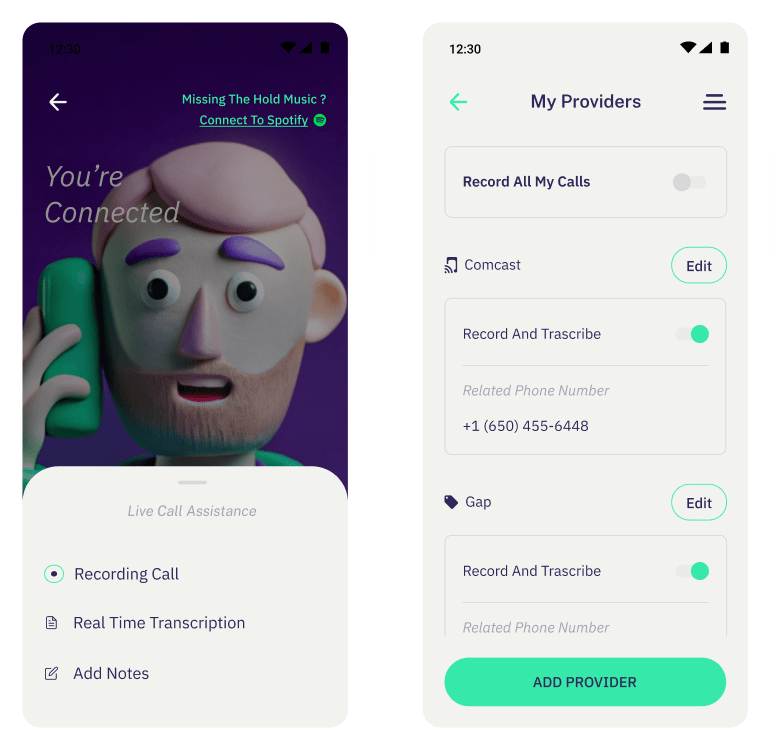
Call recording & transcript - Settings
Additionally, users can update their preferences in their profile at any time.
When the call starts, users can access related call assistance features, such as live transcription and note-taking.
Recording a call can be turned on or off at any time during the call based on the user’s preference.
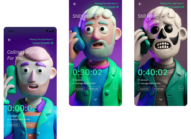
Call Now or Later
Reminder
We found that users often make calls during work breaks, where they may not be available when the call is answered. To address this, we aimed to provide users with a greater sense of control and flexibility over their calls.
Call timing
Once the system is predicting the call timing, we communicate it to the user.
In this same message, taking in consideration that the timing of the returned call might not be comfortable, we offer the user the possibility to “call later”, scheduling the call for a more convenient time.
Additionally, when a call arrives, users can decline and reschedule it for later, with an indication appearing on the home page.
Trust and Anxiety
Reminder
Following the user testing, my goal is to create a more engaging wait experience and build trust step by step. I offered a few solutions:
Trust Issues & Anxiety
- Keeping it “familiar”: Users can connect their personal Spotify for enhanced hold music, which stops when the call arrives.
- Call progress is visually represented and changes with each step, providing entertaining content for screen-fixed users. GIFs were chosen for the MVP due to their ease of development.
- Additionally, we explored advanced entertainment options, including partnerships and implementations.
Results
The team’s commitment to the research was remarkable. Even the off-site development team took the initiative to observe live user testing and recorded sessions.
Testing Improved Capabilities
Alpha Test Results
The Alpha test was conducted gradually with 50 employees.
It involved evaluating the new search abilities, though with some limitations:
- Autocomplete was based IVR (phone tree)
- Autocomplete based on users’ history
- Tags based on phone tree (IVR)
- Partial autocomplete based on popular issues, without AI integration
Initial data indicated an immediate enhancement.
However, given that these were internal users, we cannot guarantee they solely utilized the app for its intended purpose, despite our guidance.
Results from Follow-Up User Testing (5 Users)
After the initial user testing and throughout the alpha phase, the additional features were evaluated and proven effective.
© 2024, Aviya Serfaty | Built by David Gershon